Expertise
Ha’ne Sushi is a new take on the traditional sushi train concept and the contemporary space was designed by Brisbane-based studio Tonic Design which, through the use of warm timber and hints of blue, created the perfect simple, yet playful environment.
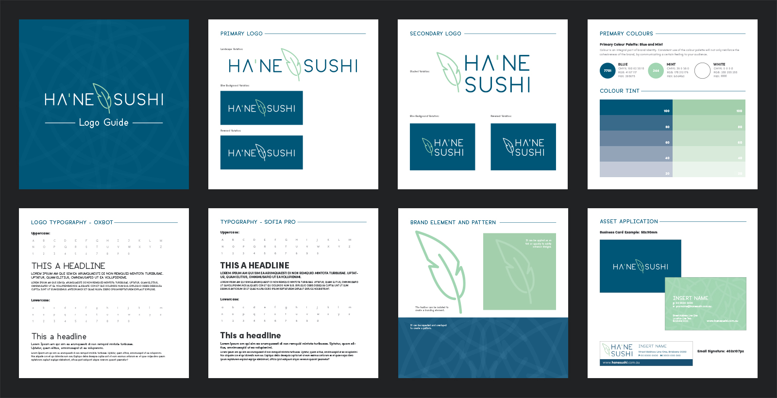
Just like the brief provided to the architects, Follow was engaged to create the business name, brand and style guide that aligned with the traditional approach of the food while reflecting the fresh, clean feel of the physical space.
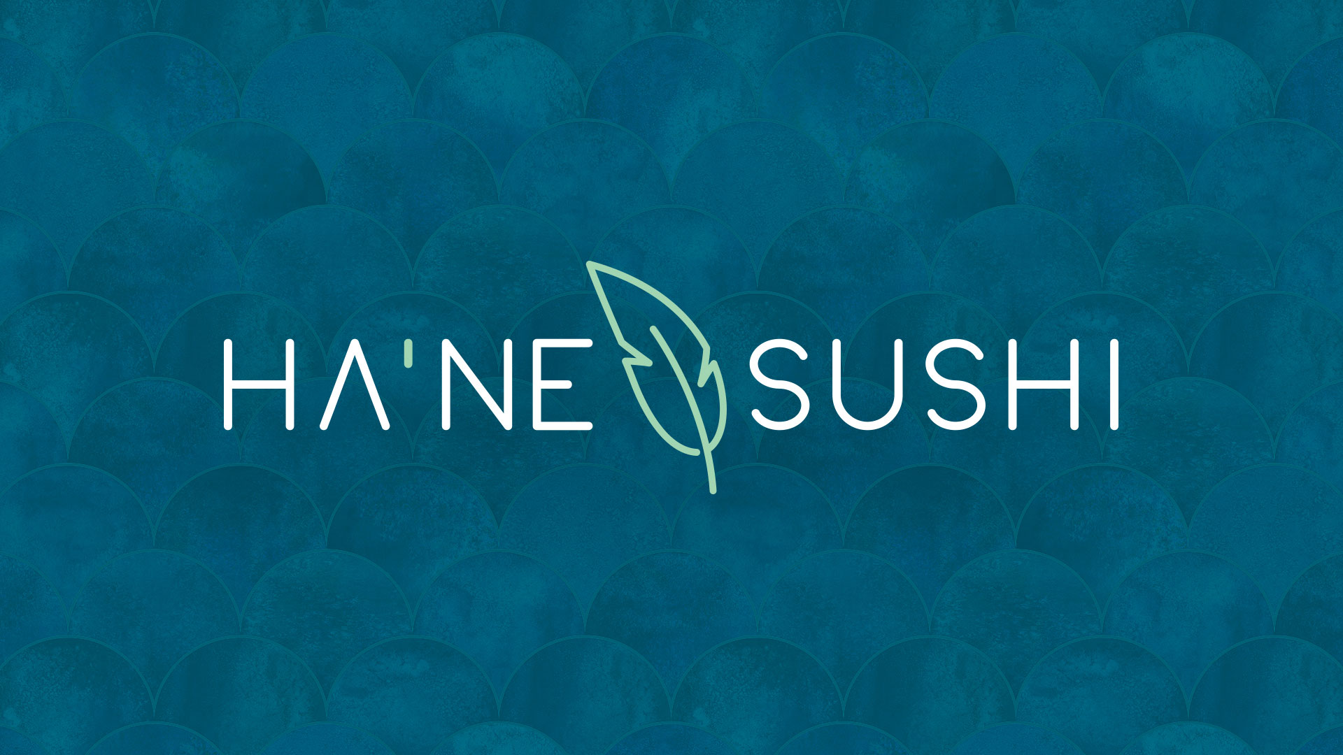
Follow provided a range of names from fun and playful to traditional, and worked closely with the Ha’ne Sushi management team to refine, eventually agreeing on the traditional Japanese word which translates to ‘feather’ and symbolises the fresh, light menu and space.
The branding uses a clean, minimal feather icon and sophisticated font, and complimented the colours of the interiors.

Do you have a brief that needs cracking?
Get StartedMore work
Gold Stackers Australia
A precious metal company entrusted Follow with their brand refresh.
Tapworks bar and grill
We tapped into the clients vision and did a bit of 'consumer research' along...